Livens & Reed
I did my part in carrying on a family legacy of helping others through a fresh website redesign.
Summary
Art Direction
UI/UX Design
Development
Project Management
Responsibilities


Background
Not all sites should get a redesign, in fact it can sometimes harm a site. however, when there are enough changes and the site isn’t performing like it should it can be totally worth it.
My initial conversations with the Livens & Reed attorneys were around fixing weird UI and updating some content issues. But, when Reed started talking about breathing new life into the website I took the opportunity to dig a little deeper.
Carrying on the legacy
Carrying on the legacy


Research
For more than 25 years the firm has been helping folks during their hardest times. With the recent passing of Chads father, founding member Stephen, it was imperative that the firm capture the legacy of their work, and highlight their greatest asset, their people.
Creating user stories, I was able to clearly identify the goals for the redesign. Along with this, a full evaluation of the site’s performance metrics, and accessibility considerations uncovered plenty of opportunity to level-up the site.
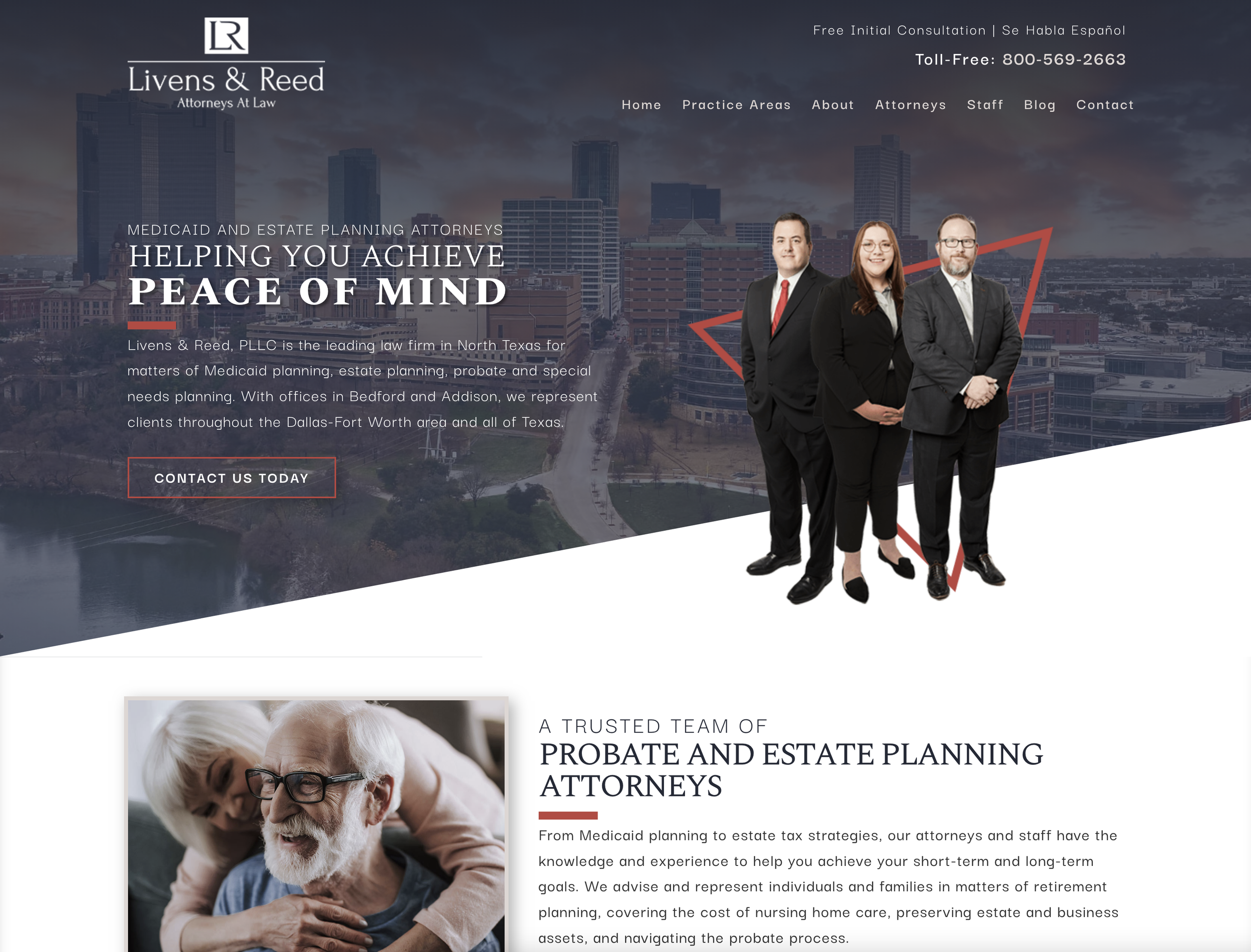
One specific discovery was the traffic on the attorney bio pages. They are the most heavily trafficked pages, however the original site only linked to them in the main navigation. Not only was this an opportunity to direct some traffic, it was the perfect way to showcase some of the important faces around the firm.
Key Considerations
One of the first places I check for any type of site marketing anything is mobile. For Livens & Reed’s original site, mobile responsiveness seemed like an afterthought. Creating a mobile friendly navigation, responsive fonts and images, and proper spacing put the firms best foot forward in a market of users researching attorneys on their phone.
By properly structuring headers and dialing back on the content-heavy sections, hone in on the content structure of the site, allowing that content to drive the layout and flow of the home page. With some clever section transitions and punchier color contrasts, I was able to take the home page to the next level.
During my evaluation of the site, there were several key practice pages for the firm that were nearly inaccessible. A user would either have to know where to look, or use some serious google kung-fu to even land on one of these pages. In the new design, i created a full sidebar navigation to allow users to hop back and forth seamlessly from practice to practice in the internal pages.
“I had no idea that our users couldn’t even click our number to give us a call.”